We Present You Freepik Company

As Freepik started to get bigger and provide more services to graphic designers, it developed three more independent projects: Flaticon, the largest icon database, Tutpad, a platform with online graphic design courses and tutorials taught by experts and Piktab. This Chrome extension helps you find and share the best free graphics resources. To combine these four different projects, the company had to find a way to preserve their individuality, but unite the concept. The goal was to keep the uniqueness of each project, yet show that they are all part of one company.
Structure
In 2018 four projects were united under the name of “Freepik Company.” Freepik identity and the title were chosen as a base since this project is the oldest and widely known, so it speaks to our target audience. We used this opportunity to give Freepik’s logo a fresh makeover, and we’re talking about it here. Besides the rebranding of one project, our designers needed to create a new visual language that will integrate all these changes and, at the same time, facilitate the future extension of the brand.
Color
Since color is a powerful tool when establishing a hierarchy with information and improving the user’s experience and the project’s interface, the company has created a color palette characterized by the logo’s colors, as well as those derived from them. Also, we’ve created a range of neutral cold greys that take on the role of the conducting element between the different, more saturated tones. Each one of the primary colors and their derived ranges associated with a project: dark blue is Freepik Company, blue is Freepik, green is Flaticon, red is Tutpad, and purple is Piktab. The range of orange yellows are associated with the Premium service and is common throughout all of the projects.
Font
Apart from the color base, the company had to find a font that could unite all the projects. It was essential to use the font that represents the company and works well in slogans, bodies of text, and interactive texts. Proxima Nova Family completes all those requisites, so it became the official font of Freepik Company.
Icons
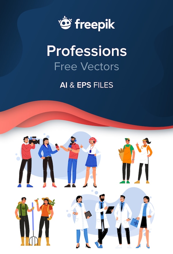
We use icons across each web site to give prominence and to enhance the usability of specific elements of the interface. To improve user experience, we have created our own set of icons that we use in all our projects. Our icons are simple, and they send a clear message, and they don’t need to be accompanied by text.
We’ve also created our illustration style to develop the new visual language so we can improve communication with our users. It’s not about ornamenting our product; the illustrations are only used in concrete spaces. These may be places in which the message is more complex, or is not entirely clear or wherein areas that require more interactivity from the user. Using our illustrations, we can support our texts in a way that makes our message much more potent and effective. Check the full article on our Illustration Guide here.
Illustrations
Our main objective was for our users to be able to differentiate one project from another, but also to understand that they all belong to the same group. For this reason, each project, even with a different identity, has the one structure and color base. We also use the same style of illustrations and icon sets to highlight this connection.
To make sure our logos are correctly used in correct sizes and with the right color palettes, we’ve prepared Freepik Design Guide. There you can find all information about Freepik company design style and download the official resources directly from us.